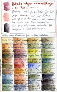
In one of the Yahoo-groups I´ve joined recently we´re discussing art workbooks/sketchbooks and perfect watercolour palettes. I´m posting these pics to show my latest experiments in both areas. (Other pages from this book can be seen in earlier and coming posts, and it will be published in it´s entirety on my homepage once it is filled.)
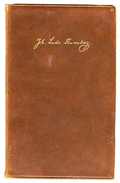
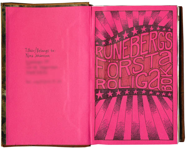
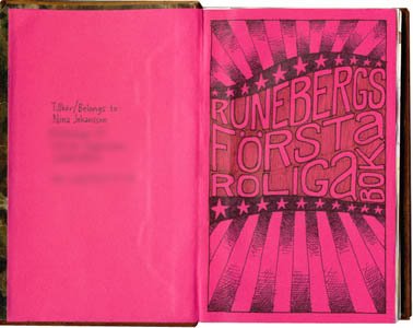
The book is a rebound leather cover of an old Runeberg novel that I ripped out (sorry, Swedish/Finnish literature-lovers, but have you ever tried actually reading his stuff??). The new signatures in it are joined together with a technique I found in “Making and keeping creative journals” (Suzanne Tourtillott, Lark Books), where you sew in linen tape across the spine of the text block for stability. Then I glued the whole text block into the cover with the pink endpapers. The book is quite small, 17,5 x12 cm (about 7 x 4.7 inches), and very sturdy. I´m actually not sure what paper I used in it, since I decided to use up paper I had left from another project. It goes well with pencil/pen/ink/watercolors, but is perhaps a bit thin if you want to get really messy with wet media.
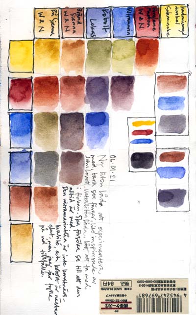

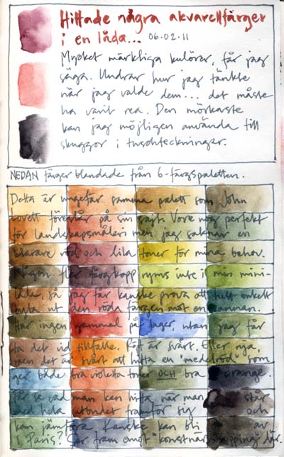

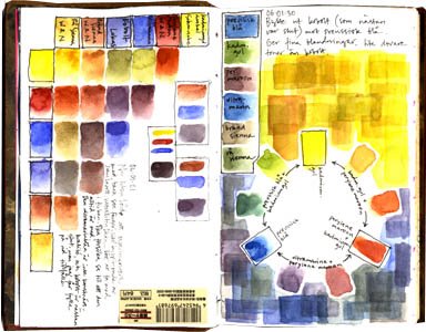
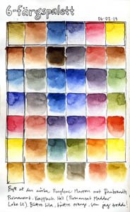
The first three colour tests are from my small watercolour palette with only six colours in it. I tried out various mixes first just to see the overall impression I got from the colours, and they looked perfect for landscape painting but I missed a clear orange and purple mixes so I changed the red color from perylene maroon to permanent madder lake light and now I´m pretty content with the mixes I get.
My small palette is always with me, I use it mainly with a Niji waterbrush, and I want it to be as versatile as possible without too many colours in it. (If you´re interested, the colours are cadmium yellow dark (schmincke), permanent madder lake light (rembrandt), ultramarine (don´t know what brand, I borrowed a tube from a friend to fill my little half pan…), phtalo blue (no brand here either), burnt sienna (winsor & newton) and raw sienna (winsor & newton).

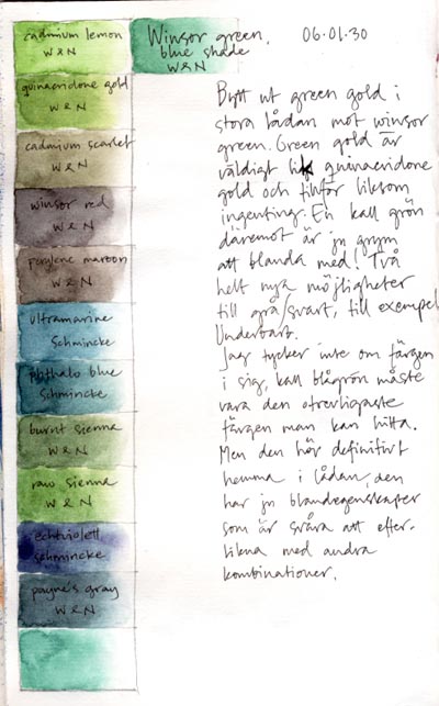
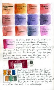
The other two colour tests are with my latest two additions to my bigger watercolour palette. I threw out green gold (it looks very much like quinacridone gold with a little blue shade in it, so I figured I didn´t really need it) and replaced it with winsor green blue shade (gives marvellous green and gray mixes, among others). And then I changed an echtviolett to quinacridone magenta – it´s impossible to “raise” a purple color to pink, but easy to mix a purple from magenta, so I think the magenta gives me a lot more possibilities. The mixes on these images are these two new colours mixed with all the others in my palette, just to get to know them better.
0 Comments
Nice journal and notes, Nina..I joined that group too..looking forward to all the exchanges soon!
Dede
Nina, I really like your color notes. You inspired me to start a book of watercolor tests too. Jean
Nina, enjoyed your blog. I’m interested in your views on watercolour. I’ve just started a Watercolour Blog. It’s a bit mixed up at the moment as I’ve only just started blogging. Hope to sort it out soon. Please drop by and give me some support, I’m sure you’ll find some interesting bits and pieces there in time.
Thanks,
John.
This is really neat to see Nina, thanks for sharing. :o)