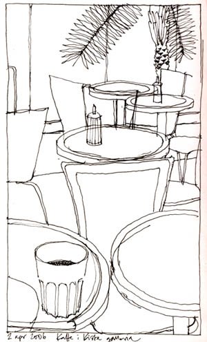
I went shopping for a new keyboard for the computer today (bought a Logitech with a really nice feel to it) and had a coffee afterwards in a café nearby. I made this quick (about ten minutes) line drawing of a part of the café, feeling really stressed because people were walking right by my chair looking down into my sketchbook. Of course I didn´t give myself the time to do any crosshatching or details and I wasn´t particularly happy with the result.
When I came home I thought I should still try to save that little drawing somehow, so I scanned it and tried a few things with it in Photoshop. I often feel that drawings colored in Photoshop – or even worse, Illustrator – often feel a little “dead”, if you know what I mean. It can look really cool sometimes if you do it properly and find your own style with it but with my own drawings I mostly just feel like “oops, it died”. So what I do is I add textures.
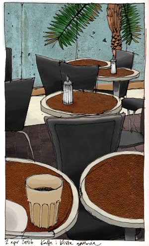
I´m a real geek when it comes to digital photography, I go around taking snapshots of surfaces like wood, metal, textiles, paper grain, rust, dust, scratches, colorstains and other general signs of decay that you can always find everywhere. I have a whole lot of those textures by now, and I use them a lot when I work in Photoshop. They add a bit of extra spice to images with a lot of flat colour in them. Now, I´m not used to explaining my way of working in Photoshop in English, but I´ll give it a try…
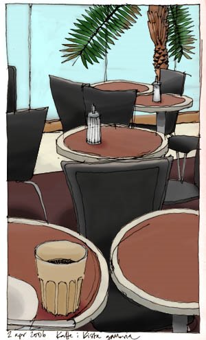
I start out with the drawing, getting rid of the white in it so that I have the lines against a transparent background. To colour the drawing I make selections for every area that I want to colour and then fill it with whatever colour I want, in a layer beneath the line drawing. I make sure to save the selections, that way they can be used again. When I´m done colouring (the second image above), I start adding textures. I drag and drop a texture photo onto the drawing so that the photo gets it´s own layer and then I make sure I´m happy with the size and placement of the texture. I then load one of the selections I previously saved, in this case for example the tables, invert the selection and erase. Now the texture photo is left only in the shapes of the tables. I then choose a suitable blending mode for that texture layer – often multiply – and there you are! The tables have both colour and texture! I then go on to the next texture with the same procedure.
I like this way of colouring my drawings, I think it gives them a bit more life than just plain flat digital colour. And believe me, once you start collecting textures, if you haven´t already, you will see the world around you differently. Every little rust stain is a potential image enhancer, so you´d better keep your digital camera ready!
0 Comments
I really like what you’ve done combining sketching with photoshop.
I think it turned out very very well and I am intrigued by it! I have never liked anything gimmicky and this doesn’t strike me so in the least! Thanks!
If that isn’t the most perfect composition, I don’t know what is! I find a lot of photoshop-colored sketches to look a bit plastic and lifeless, but not yours. However, I have to admit that I’m so much in love with the original drawing (those lines are full of energy and verve) that I like it the best of the three.