Urban sketchers´symposium in Amsterdam
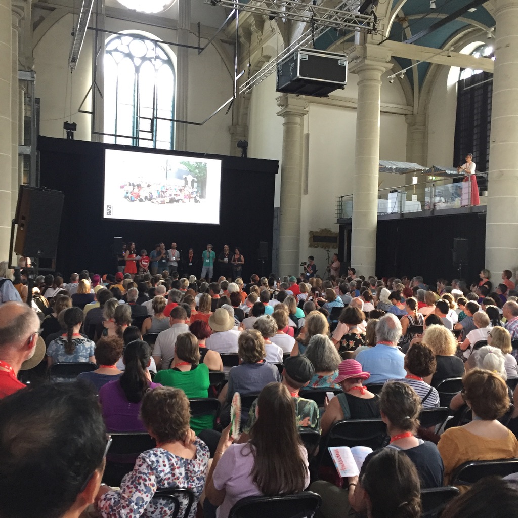
I had the great honor of being one of the workshop instructors at the Urban sketchers symposium in Amsterdam in 2019. As usual, four days of fun, meeting…
I had the great honor of being one of the workshop instructors at the Urban sketchers symposium in Amsterdam in 2019. As usual, four days of fun, meeting…
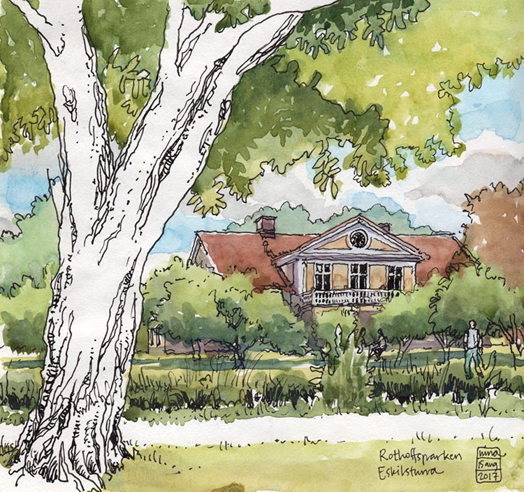
I spend some time at the summer house every year, and of course try to find time to draw while I´m there. Sometimes I feel like I must…
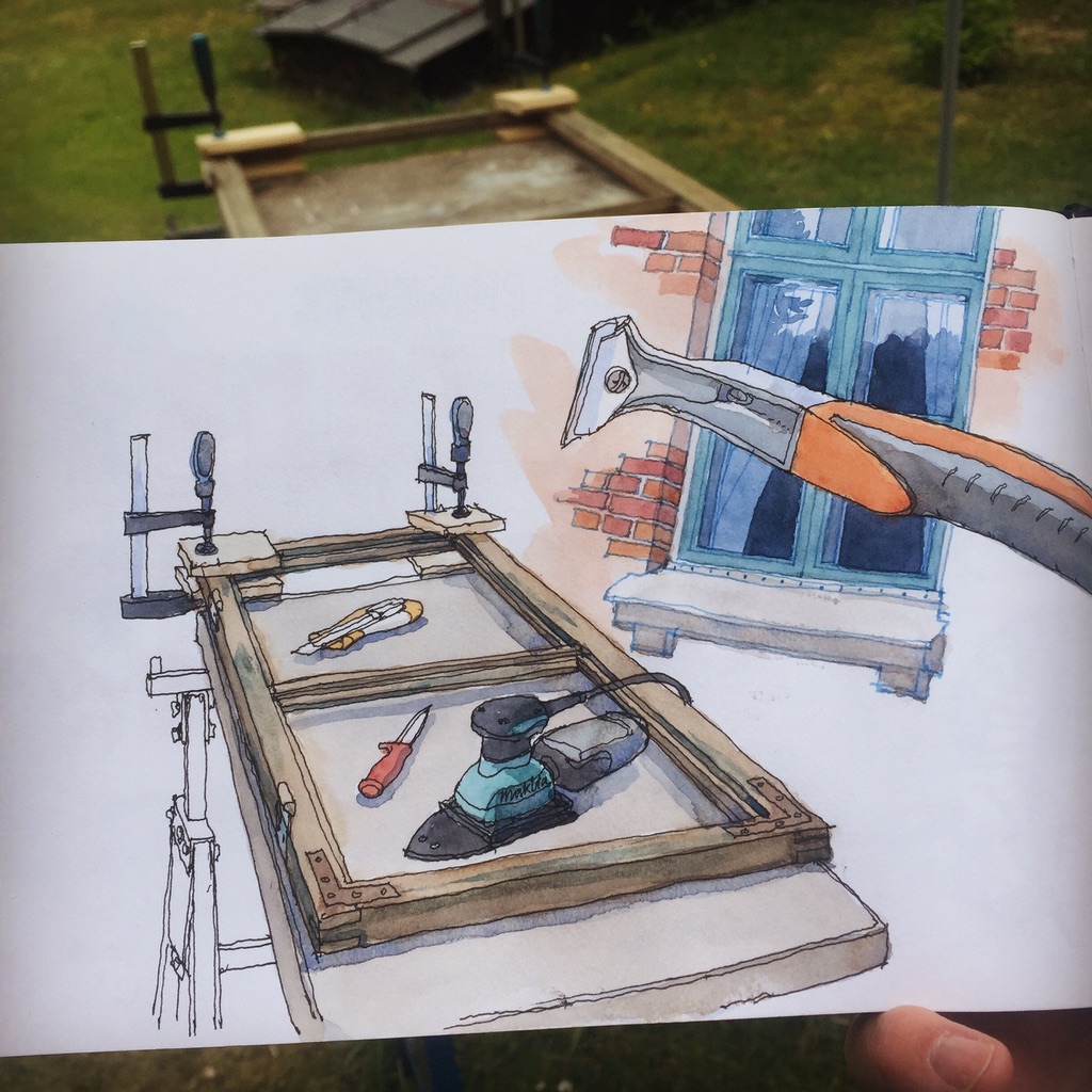
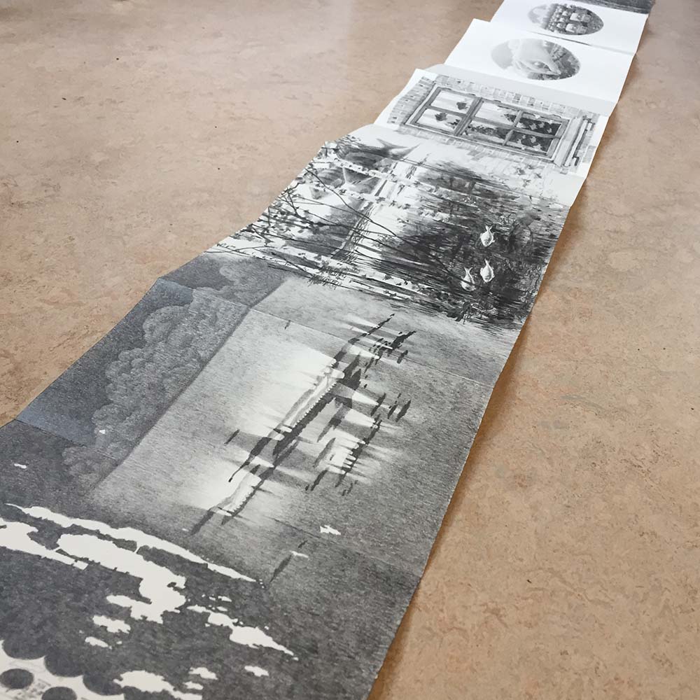
Sometimes it´s fun to take your sketches a bit further, to see what you can do with them in another medium or as an idea for other works.…
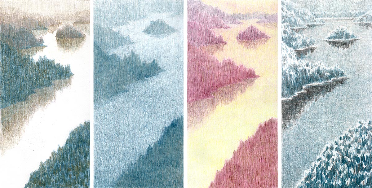
I train commute to work. And every day I pass by this view from a train bridge outside Södertälje, and every day it looks different. Isn´t that amazing?…
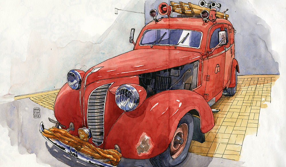
I have been revisiting the veteran garage near where I live every now and then during the last year or so. This is a place where (mostly) retired…
The last few years I have participated in Inktober, a drawing challenge where you make an ink drawing every day for the month of October. It was started…
Skröna (Tall tale) is a long sketchbook with pencil drawings concerning a summerhouse I share with my extended family. I worked on it for most of the spring…

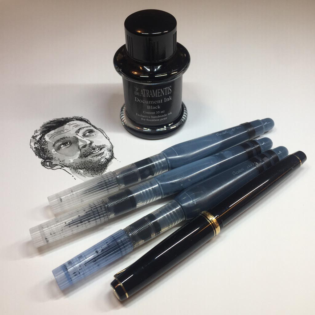
On a whim, a while back, I bought myself three Bic Cristal pens, you know, those classic cheap no-good ballpoints that´s been around forever. I bought one black,…
I am part of the Urban sketching community, and Stockholm has it´s own local group that meets up on the last Sunday of every month to draw together.…
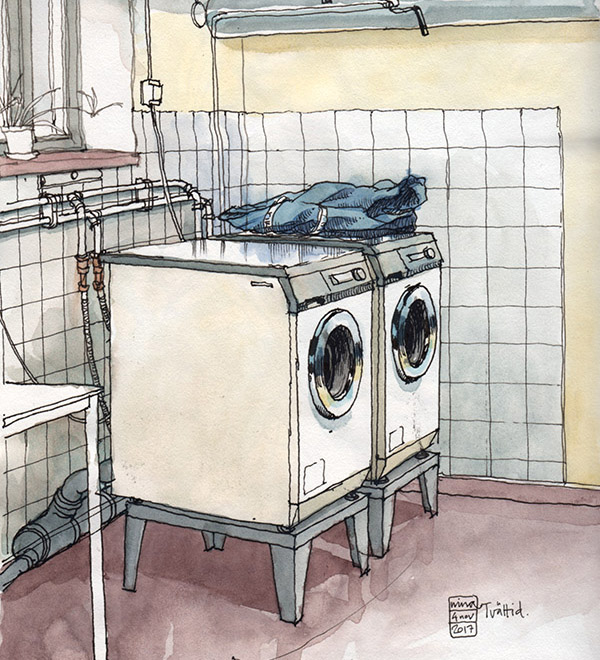
Doing laundry is a great chance to draw one of those things that we do without even thinking about it. It is a slow process and leaves heaps…